Literary Manhattan
Where a love of literature and New York City converge, a digital makeover was due.
Digital Infrastructure
We began by addressing a number of security concerns by commiting to a security policy that secures every point of access and hardens WordPress.
- Strengthened passwords
- Removed all non-essential user accounts and server files
- Updated WordPress core and plugins
- Scheduled regular database and media backups
- Updated chmod permissions, database salt, and more
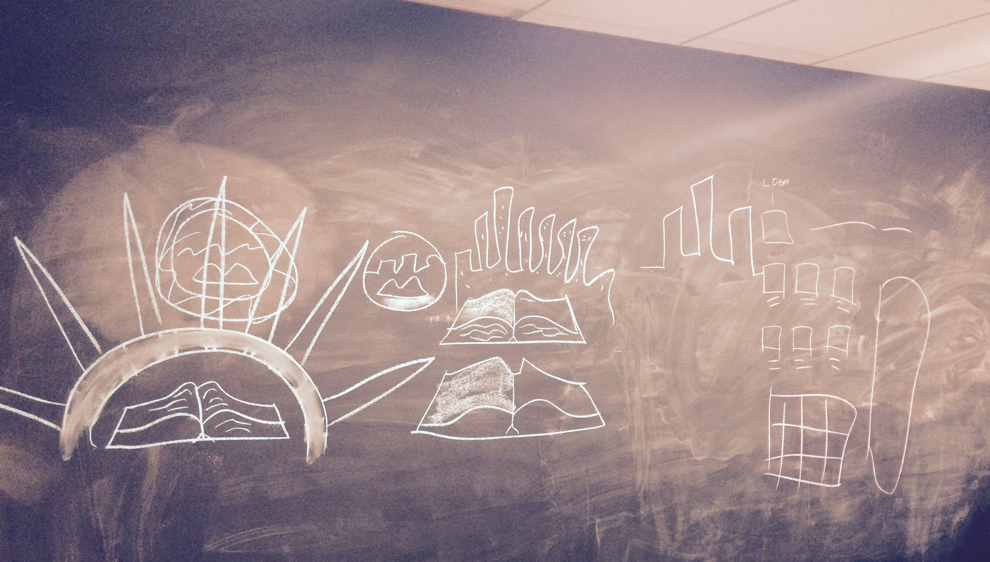
Brand Identity
We championed a crisp color palette that recalls the famed oxidized copper of New York City's Statue of Liberty.
- Your logo should be simple, distinct, and appropriate
- Michael Bierut explains what makes a truly great logo
- We proposed an abstract open book, denoting literature, between two towers that form an "M" for Manhattan
- Our proposal is best described as "Literature at the Heart of Manhattan's History"
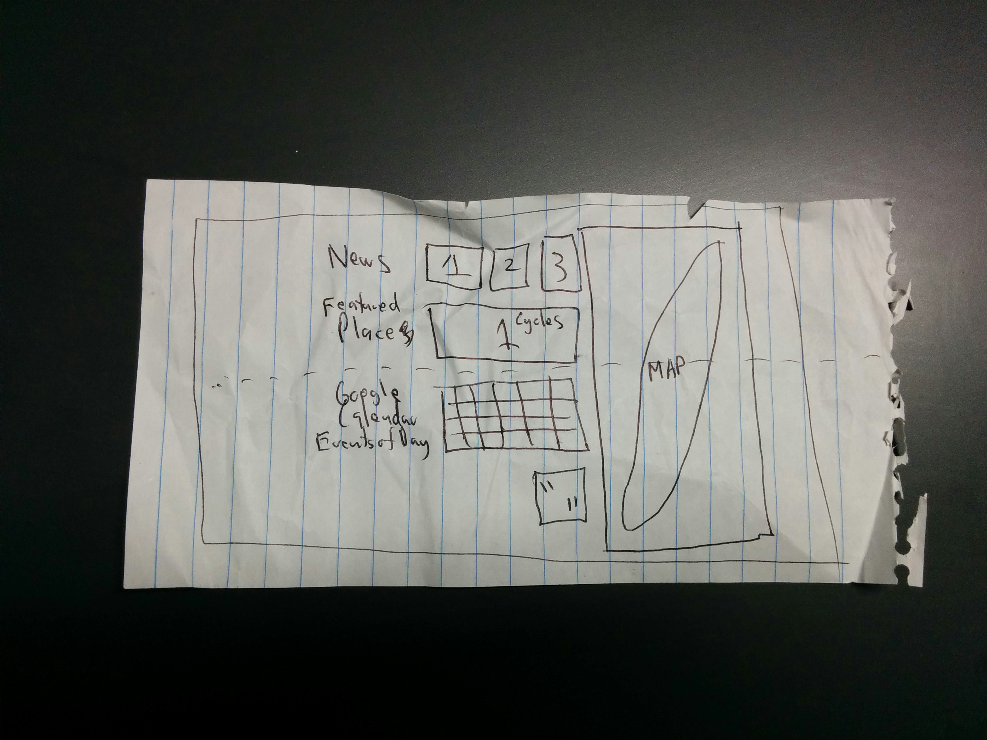
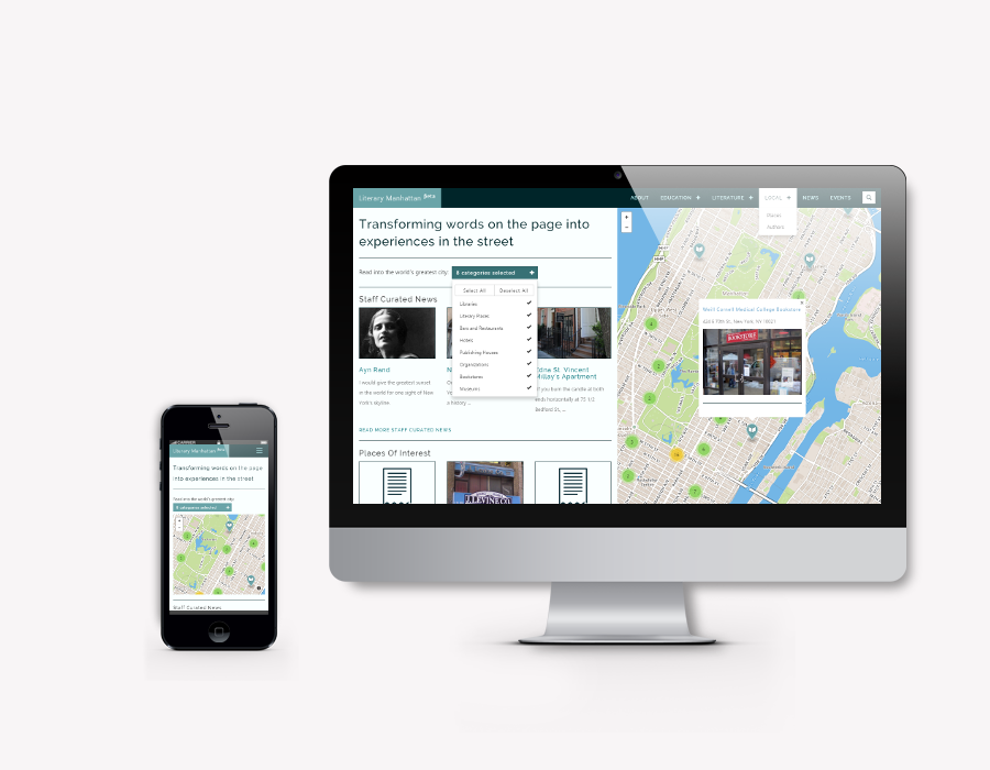
Web Design
We obsessed over literary elements and a solid reading user experience.
- Mobile accessibility and a responsive design meets the evolving ways we access information
- Mapbox clustering ensures you're not bombarded with options while dynamic filtering shows you just what you're looking for
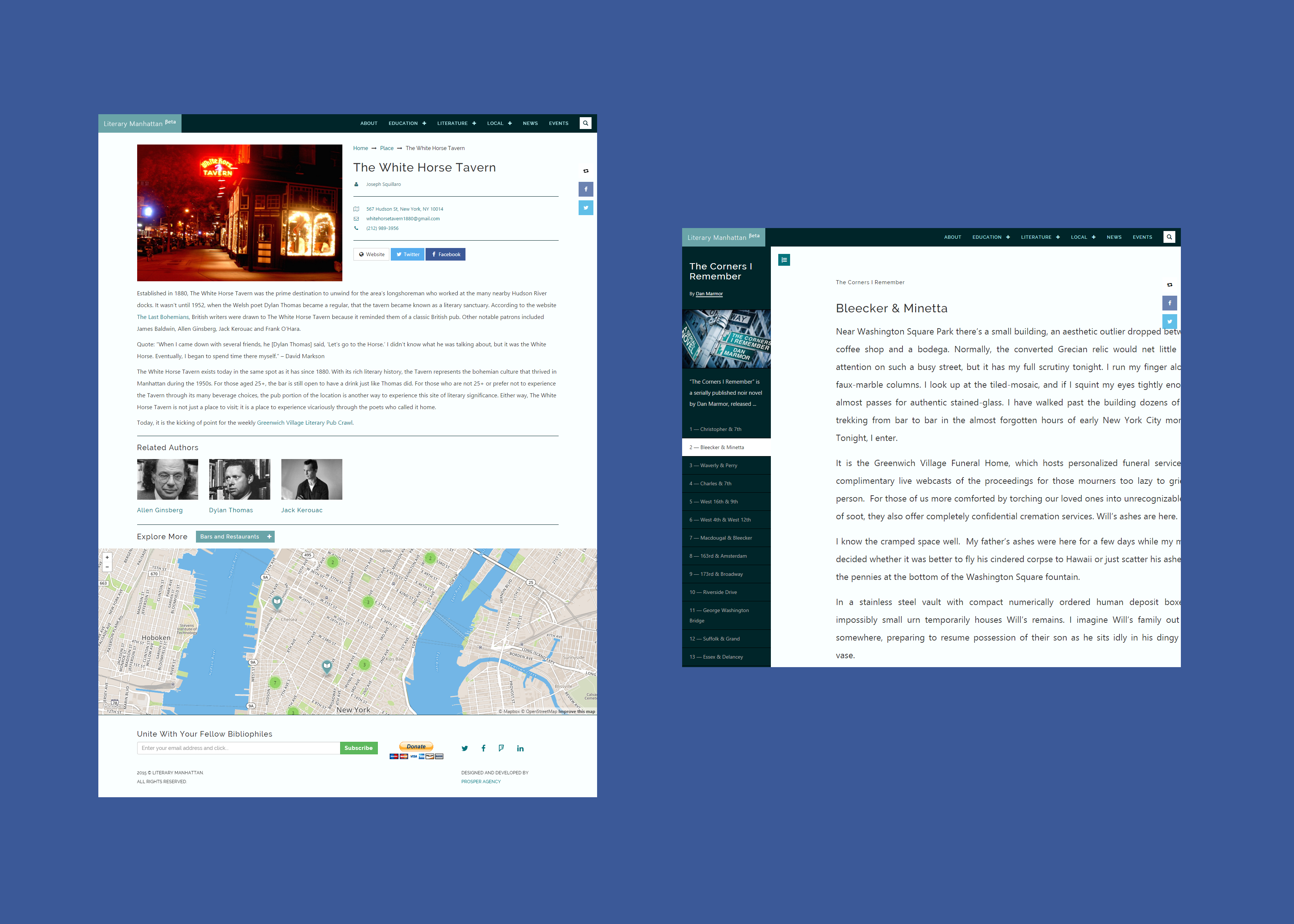
- Original works of literature display within a touchscreen compatible e-book reader
- Author pages, for anyone who publishes at Literary Manhattan, and Authors pages, for New York City's historical icons, uniquely compliment their work
- Solid information architecture means everything's related and easily discoverable
- Bookshelves representing archives, mobile menu animations, etc.
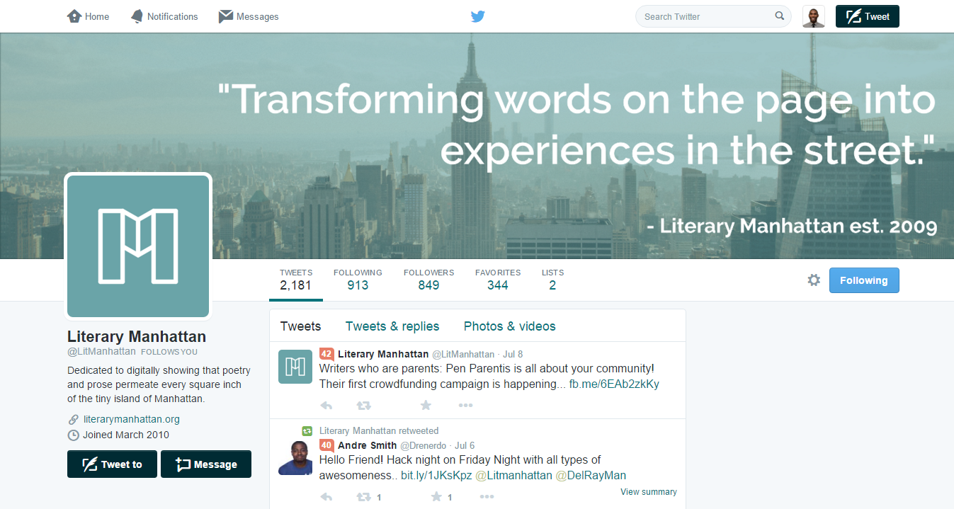
Social Media
Whether someone visits your website or social media platforms, there should be a consistent, unified experience throughout their online relationship with you.
- Updated social media profile branding
This redesign has revitalized and improved our entire organization.
— Aaron Siewert, Vice President and Senior Editor, Literary Manhattan